
The Ultimate Guide to Effective Ecommerce Website Design
We all know how important it is to have a good online store. Your website is basically your storefront, right? If it looks messy or is hard to use, people will just click away. That’s where good Ecommerce website design comes in. We’ve put together some tips to help you make your online shop look great and work even better. Let’s get your site ready to make some sales!
Key Takeaways
- Your website’s first impression matters a lot. Make it look good and easy to use right away.
- Clear navigation helps shoppers find what they need without getting frustrated.
- Great product photos and clear descriptions make people want to buy.
- A simple checkout process reduces the chances of customers leaving before they pay.
- A fast, mobile-friendly website is a must for keeping customers happy and making sales.
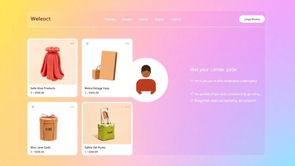
Making Your Ecommerce Website Design Shine Bright
First impressions count, right? We’ve all been there – landing on a website that looks like it was built in 1998 and immediately clicking away. Your ecommerce site is no different. The initial seconds a visitor spends on your page can determine if they stick around or bounce faster than a rubber ball. We want them to feel welcomed, intrigued, and confident that they’ve found the right place to shop.
First Impressions Are Everything (Like That Time You Wore Crocs to a Wedding)
Think of your homepage as the digital equivalent of your storefront. If it’s cluttered, confusing, or just plain ugly, people aren’t going to come inside. We need to make sure it’s clean, inviting, and clearly communicates what you sell. A good first impression means:
- Clear Value Proposition: What do you offer, and why should they care? Make it obvious.
- Professional Aesthetics: Clean design, good quality images, and consistent branding go a long way.
- Easy Entry Point: Guide visitors towards what they’re looking for right away.
It’s like showing up to a party. You wouldn’t wear mismatched socks and a stained shirt, would you? (Unless it’s a costume party, but that’s a different story). Your website needs to look put-together and ready to impress. Keeping your site looking sharp is part of ongoing Web Maintenance US, making sure those first impressions are always positive.
We’ve all had that moment where a website just feels right. It’s not just about looking pretty; it’s about creating an atmosphere of trust and professionalism from the get-go. A little effort here saves a lot of headaches later.
Navigation That Doesn’t Make Users Want to Pull Their Hair Out
Imagine walking into a store where the aisles are a maze and the signs make no sense. Frustrating, right? That’s what bad navigation does to your online shoppers. We need to make it super simple for people to find what they’re looking for. This means:
- Logical Categories: Group your products in a way that makes sense to your customers.
- Clear Menu Labels: Use straightforward terms like ‘Men’s Shoes’ instead of ‘Footwear Emporium’.
- Search Bar Prominence: Make sure the search bar is easy to find and works well.
We don’t want users getting lost and giving up. A well-thought-out navigation system is key to keeping them on your site and moving towards a purchase. It’s about making their journey as smooth as possible.
Visuals That Make People Say ‘Ooh, Shiny!’
Let’s be honest, we’re visual creatures. High-quality images and videos can make a huge difference in how appealing your products are. Blurry, pixelated photos? Big no-no. We want visuals that:
- Showcase Products Clearly: Multiple angles, zoom functionality, and lifestyle shots are great.
- Are High Resolution: Crisp, clear images look professional and trustworthy.
- Load Quickly: We’ll talk more about speed later, but good visuals shouldn’t slow you down.
Think about those unboxing videos or those perfectly styled product shots you see online. That’s the kind of visual appeal we’re aiming for. It’s not just about showing the product; it’s about making people want it. Good visuals grab attention and make your site memorable.
The Secret Sauce of a High-Converting Ecommerce Website Design

Alright, let’s talk about what really makes an online store sell. We’ve all been to those websites that just feel… off. You can’t find what you want, the buttons are weird, and you just nope right out of there. That’s where the "secret sauce" comes in – the design elements that actually get people to click "buy." It’s not just about looking pretty; it’s about making it super easy and appealing for folks to spend their hard-earned cash.
Product Pages That Sell Themselves (Almost)
Your product pages are your virtual salespeople. They need to be amazing. Think about it: this is where the decision happens. We need to give people all the info they need, without overwhelming them. Good photos are a must, obviously. We’re talking multiple angles, zoom-in features, and maybe even a short video showing the product in action. Descriptions should be clear, concise, and highlight the benefits, not just the features. What problem does this solve for the customer? Why should they care?
- High-quality images from every angle.
- Clear, benefit-driven product descriptions.
- Customer reviews and ratings prominently displayed.
- Easy-to-find "Add to Cart" button.
The Art of the ‘Add to Cart’ Button (It’s More Than Just a Button!)
Seriously, this little button is a big deal. It needs to stand out. We’re talking a contrasting color that pops, a clear label like "Add to Cart" or "Buy Now," and it should be in a consistent, easy-to-spot location on every product page. We don’t want people hunting for it! A little animation when you click it can be a nice touch, giving that instant feedback that, "Yep, it’s in your cart!" Making this button obvious and inviting is key to moving people down the sales funnel.
Streamlining the Checkout Process: No More Cart Abandonment Nightmares
This is where so many online stores trip up. A complicated checkout is like a brick wall between a sale and a lost customer. We need to make it as smooth as possible. Think guest checkout options, minimal form fields, and clear progress indicators so people know where they are in the process. Showing trust badges for security is also super important here. Nobody wants to feel like their payment info is going to end up on the dark web. Keeping things simple and secure means fewer people will get frustrated and leave their carts full of goodies. Regular checks, like those we do with Web Maintenance US, help catch any glitches before they become big problems.
Mobile-First Magic: Designing for the Small Screen
Remember when websites were mostly for desktops? Yeah, me neither. These days, most folks are browsing on their phones, and if your ecommerce site isn’t playing nice with that tiny screen, you’re basically leaving money on the table. It’s like showing up to a party with no snacks – nobody’s sticking around.
Why Your Ecommerce Website Design Needs to Be Mobile-Ready
Seriously, it’s not even a question anymore. People shop while they’re waiting for coffee, on the bus, or even, dare I say it, while pretending to listen during a meeting. If your site is a pain to use on a phone – think tiny text, buttons you can’t hit, and endless zooming – they’re just going to bounce. And guess what? They’re probably not coming back. We’ve seen firsthand how a clunky mobile experience can tank conversion rates, which is why we always stress the importance of mobile-friendliness. It’s not just about looking good; it’s about making sales.
Responsive Design: The Chameleon of the Web
So, how do we make sure our site looks good everywhere? Responsive design is the answer. Think of it like a chameleon, changing its colors to fit its surroundings. A responsive website automatically adjusts its layout, images, and text to fit whatever screen size it’s being viewed on. This means your desktop users get a full experience, your tablet users get a nicely adapted view, and your mobile users get a site that’s easy to read and click through. It’s the standard these days, and honestly, anything less feels a bit… old-fashioned. Keeping up with these design trends is part of what we do, and it’s why regular web maintenance is so important.
Touch-Friendly Navigation and Buttons
Okay, so your site is responsive. Great! But are people actually going to be able to use it on their phones? This is where touch-friendly design comes in. We’re talking about buttons that are big enough to tap with a thumb without hitting three other things by accident. Menus that are easy to open and close. Forms that don’t require the precision of a brain surgeon to fill out. It’s all about making the user’s journey as smooth as possible. We like to think of it as giving your customers a comfortable place to land, not a minefield to navigate.
Making your site easy to use on a phone isn’t just a nice-to-have; it’s a must-have for anyone serious about selling online today. If it’s fiddly, people will leave.
Here are a few things to keep in mind for touch-friendly design:
- Button Size: Make sure buttons are at least 44×44 pixels. That’s big enough for most fingers.
- Spacing: Give elements some breathing room. Don’t cram everything together.
- Clear Calls to Action: Make it super obvious what you want people to do next.
- Simple Forms: Break down long forms into smaller steps if possible.
Building Trust and Credibility in Your Ecommerce Website Design
Showcasing Customer Reviews Like a Boss
Let’s be real, when we’re shopping online, we all do it. We scroll down, looking for those little stars and comments from people who’ve already bought the thing. It’s like asking your friends for a recommendation, but way faster. Showing off customer reviews isn’t just a nice-to-have; it’s a must-have for any ecommerce site that wants to make sales. Think about it: if a product has a bunch of glowing reviews, you’re way more likely to click ‘Add to Cart,’ right? It tells you that other people have had a good experience, and that’s a powerful signal. We make sure our review sections are easy to find and read, with options to sort by rating or even search for specific keywords. It’s a simple way to build confidence, and honestly, it’s something we always check when we’re doing web maintenance for our clients.
Secure Checkout Badges: Peace of Mind for Your Shoppers
Nobody wants to feel like their credit card information is floating around in the digital wild west. That’s where those little security badges come in. You know, the ones that say ‘SSL Secured’ or show a padlock icon? They’re like a digital handshake, telling your customers that their personal and payment details are safe and sound. We make sure these badges are visible, usually near the checkout button or on the payment pages. It’s a small detail, but it makes a big difference in how secure people feel giving us their money. It’s a quick win for trust, and we never skip this step.
About Us Page: Tell Your Story, Build Your Tribe
This is your chance to show the human side of your business. Forget just listing your products; tell people who you are, why you started this whole thing, and what you’re passionate about. Are you a family-run business? Did you start because you couldn’t find the perfect

When people feel like they know and trust the people behind the website, they’re much more likely to buy. It’s that simple. Think of it as building a relationship, not just making a sale.
Speed Demons: Optimizing Your Ecommerce Website Design for Performance

We all know that feeling, right? You click on a link, and then… you wait. And wait. And wait some more. It’s like watching paint dry, but way less exciting. For your online store, this is a big problem. Slow websites are the absolute enemy of sales. If your site takes too long to load, people just leave. They don’t have the patience, and honestly, who can blame them? We’ve got so many other options online these days. Making sure your ecommerce website design is zippy is super important. Think of it like this: a fast website is a welcoming store, and a slow one is like a shop with a broken door that takes ages to open. Nobody wants that hassle.
Why Slow Websites Are the Enemy of Sales
It’s pretty straightforward, really. Every second your page takes to load is a second a potential customer is thinking about clicking away. Studies have shown that even a one-second delay can drop conversion rates significantly. That means fewer sales, fewer happy customers, and less money in your pocket. We’ve all been there, bouncing from site to site because one is just too slow. It’s not personal; it’s just how we shop online now. We expect things to be quick, and if they aren’t, we move on. This is where regular web maintenance, like the kind we do at Web Maintenance US, really pays off. Keeping things running smoothly means keeping customers happy and sales coming in.
Image Optimization: Making Your Pictures Fast and Fabulous
Pictures are a huge part of selling online. They show off your products, make your site look good, and help people decide what they want. But, big, unoptimized images can seriously slow down your website. It’s a balancing act. You want your product photos to look amazing, but you don’t want them to make your site crawl. So, what’s the trick?
- Choose the right file format: JPEGs are usually best for photos, while PNGs are better for graphics with transparency. GIFs are for simple animations.
- Compress your images: There are tons of tools out there, both online and as software, that can shrink image file sizes without making them look blurry. Seriously, this makes a huge difference.
- Resize images correctly: Don’t upload a massive 4000px wide image if it’s only going to be displayed at 800px. Resize it first.
Getting your images right is one of the easiest ways to speed up your ecommerce website design.
Leveraging Caching for Lightning-Fast Load Times
Caching is like giving your website a short-term memory. Instead of rebuilding every single page from scratch every time someone visits, caching stores a pre-built version of your page. When the next person visits, they get that stored version, which is way faster to serve up. It’s like having a pre-made sandwich ready to go instead of making one from scratch every time someone asks for lunch.
There are a few types of caching to think about:
- Browser Caching: This tells a visitor’s browser to store certain files (like logos, CSS, and JavaScript) locally. The next time they visit, their browser doesn’t have to download them again.
- Server-Side Caching: This is done on your web server. It stores fully rendered pages or parts of pages so they can be served up quickly.
- Content Delivery Network (CDN): This is a network of servers spread across the globe. It stores copies of your website’s content closer to your visitors, so they load pages from a server that’s geographically nearer to them. This is a big one for global audiences.
Implementing caching correctly can dramatically improve your site’s speed and user experience. It’s a technical step, but the payoff in performance is huge for your ecommerce website design.
SEO Superpowers for Your Ecommerce Website Design
Alright, let’s talk about getting found online. If you’ve built a killer ecommerce site but nobody can find it, what’s the point, right? That’s where Search Engine Optimization, or SEO, comes in. Think of it as giving your website a megaphone so search engines like Google can hear you loud and clear. We’re going to break down how to make your site a search engine darling.
Keyword Research: Knowing What Your Customers Are Actually Searching For
This is step one, folks. You can’t just guess what people are typing into Google. You need to know. What words and phrases do your potential customers use when they’re looking for products like yours? This isn’t just about stuffing popular terms onto your pages; it’s about understanding intent. Are they looking for "red running shoes" or "best comfortable sneakers for marathon training"? The difference matters. We use tools to see what’s popular and what’s not too competitive. Finding those sweet spot keywords is like finding buried treasure for your business.
On-Page Optimization: Making Your Pages Search Engine Friendly
Once you’ve got your keywords, you need to put them to work. This means making sure your product titles, descriptions, and even image alt text are using those terms naturally. It’s about making it easy for search engines to understand what each page is about. Think of it as labeling everything clearly in your own store. We also look at things like your page structure and internal linking – basically, how everything connects. Good on-page SEO means your site is easy for both people and search bots to read.
Content is King (Even in Ecommerce!)
Who says SEO is just about keywords? Nope. Creating helpful, informative content is a huge part of it. This could be blog posts about how to use your products, guides to choosing the right item, or even just answering common customer questions. This content attracts people who might not be ready to buy right now but are researching. It also gives search engines more reasons to rank your site. Plus, it’s a great way to show off your brand’s personality. Keeping your site fresh with new content is something we often discuss with clients, and it’s a big part of ongoing Web Maintenance US.
Don’t just think about the sale. Think about the entire customer journey. Providing useful information builds trust and positions you as an authority, which search engines love.
Here are a few content ideas to get you started:
- How-to guides for your products
- Comparison articles (e.g., "Product A vs. Product B")
- Customer spotlights or case studies
- Industry news or trend reports
- Answers to frequently asked questions
Want your online store to shine? We’ll help you make your website look amazing and work perfectly, so more customers find you and buy from you. Ready to boost your sales? Visit our website today to see how we can help your business grow!
So, What’s the Takeaway?
Alright, we’ve gone through a lot, haven’t we? Building a website that actually sells stuff can feel like a puzzle sometimes. But honestly, it’s not rocket science. It’s about making things easy for people to find what they want and feel good about clicking that ‘buy’ button. Think of your website as your digital storefront – you wouldn’t want it to be messy or confusing, right? We at Web Maintenance US have seen it all, and we know what works. If you’re feeling a bit overwhelmed or just want to make sure your online shop is top-notch, give us a shout. We’re here in Orlando, ready to help you make your website shine. Let’s get your online business booming!
Frequently Asked Questions
Why is good website design so important for our online store?
Think of your website like your digital storefront. If it looks messy or is hard to shop in, people won’t stick around. A great design from Web Maintenance US makes shoppers feel welcome, helps them find what they need easily, and makes them want to buy. It’s all about making a good first impression and keeping customers happy so they come back!
What makes a product page really effective?
An effective product page needs awesome pictures that show off the item from all angles. We also need clear descriptions that tell shoppers everything they need to know, like size, color, and what it does. Adding customer reviews is super helpful too! Web Maintenance US knows how to make these pages irresistible.
How can we make sure our checkout process is smooth?
Nobody likes a complicated checkout! We simplify it by asking for only the most important info, offering different payment options, and being super clear about shipping costs. The goal is to get customers their goodies without any hassle. Web Maintenance US focuses on making this part super easy.
Why is designing for phones so critical these days?
So many people shop using their phones! If your website looks bad or is tough to use on a small screen, you’re losing customers. We make sure your site works perfectly on any device, big or small. It’s called responsive design, and Web Maintenance US is great at it.
How does Web Maintenance US build trust with our website visitors?
We build trust by showing off happy customer reviews, making sure your checkout is secure with trust badges, and having a clear ‘About Us’ page that tells your story. People like to know who they’re buying from! You can learn more about our services at https://webmaintenanceus.com.
What’s the deal with website speed and why does it matter?
Slow websites are a big turn-off! If your pages take too long to load, shoppers get impatient and leave. We optimize everything, especially images, to make your site super fast. A speedy site means happier customers and more sales. Check out our speed optimization services on our site!


